| Author |
Message |
 |
|
|
|
|
Advert
|
Forum adverts like this one are shown to any user who is not logged in. Join us by filling out a tiny 3 field form and you will get your own, free, dakka user account which gives a good range of benefits to you:
- No adverts like this in the forums anymore.
- Times and dates in your local timezone.
- Full tracking of what you have read so you can skip to your first unread post, easily see what has changed since you last logged in, and easily see what is new at a glance.
- Email notifications for threads you want to watch closely.
- Being a part of the oldest wargaming community on the net.
If you are already a member then feel free to login now. |
|
 |
2024/01/27 23:53:11
Subject: GW's new art direction sucks!
|
|

Spawn of Chaos
Warhammer 40K Universe
|
It seems like for a long time GW doesn't want to pay artists who can truly portray 40K as it as, just like they did with Adrian Smith and John Blanche at the beginning. Sure there is good art, and by good I also mean excellent, however the art is becoming too clean and de-facto becomes threatening how the setting is portrayed. Although this could be argued that it's not GW's entire fault but rather its shareholder company, who wants 40K to become more clean.
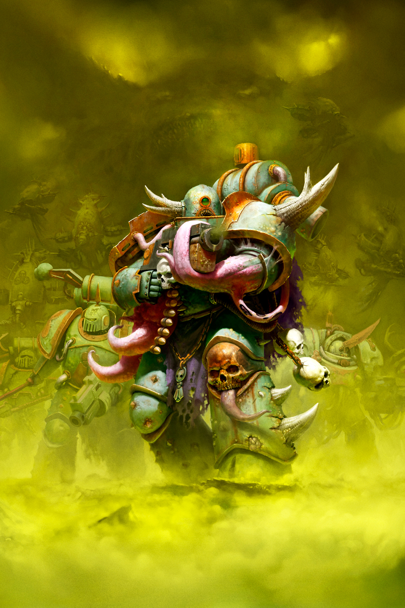
Nothing comes close to Adrian Smiths art, especially his portrayal of Horus vs the Emperor and the four traitor marines dedicated to their patron gods. The biggest example would be how they've taken the DG, from literal plague marines to a bunch of Chaos spawns of Nurgle with tentacles, mouths and horns and LITERALLY just the color green in the background.
Official art by GW, you can these images on their website.
In the first image all I see is a green background with green tentacles monsters with bright colors. Nothing special.
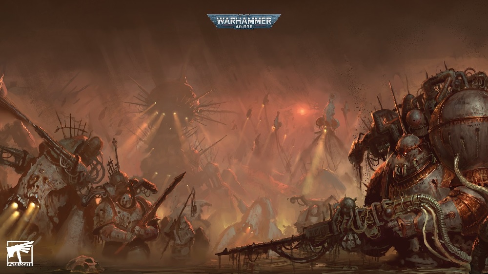
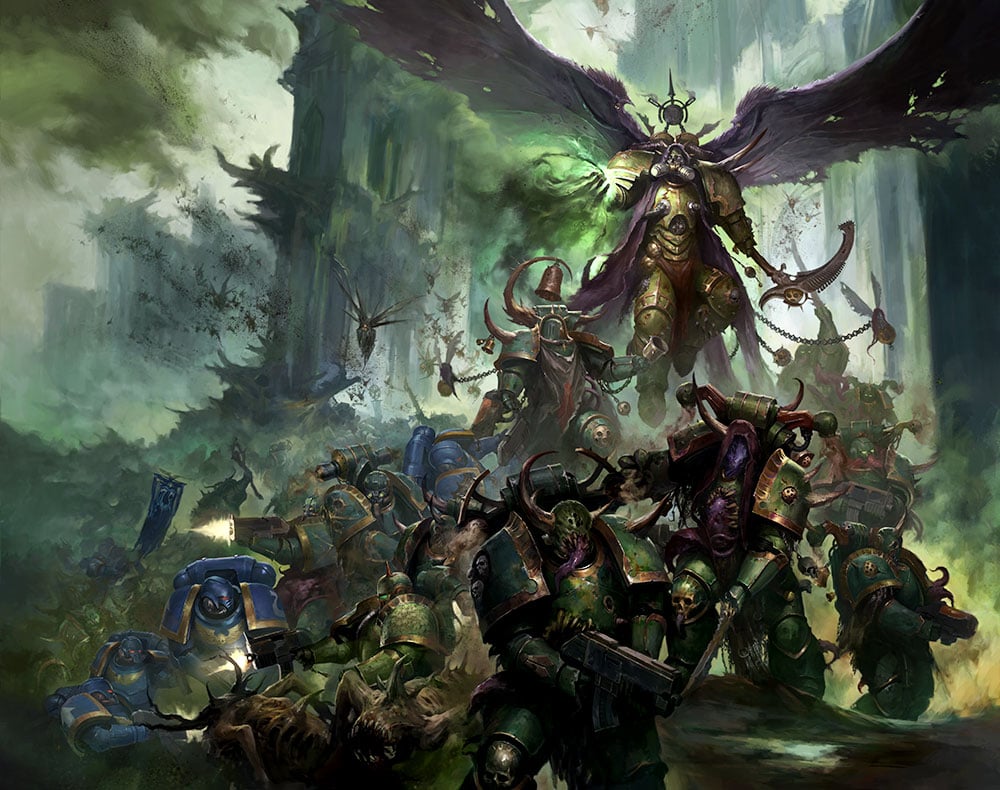
The second image has darker colors, and we can see a war going on between the DG and Ultramarines led by Morty. Yet still we have the dark green color with clouds, and yet again the tentacle monsters. Better than the first image, still incapable of capturing the DG.
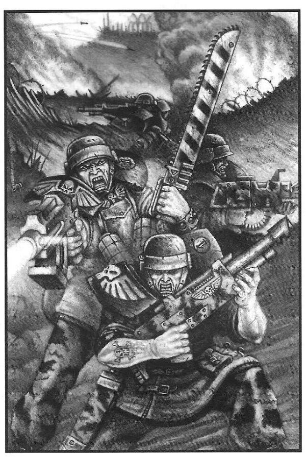
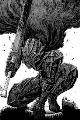
Compare this art to what Adrian Smith did
And here we have Adrian Smiths iconic Plague Marine. In the background we the sky that appears as decaying flesh that tears itself apart with blood dripping out of it. We can see the Rot Flies who's upper part is black and their lower part almost as the same color as the rotting flesh. The Plague Marine has the banner of Nurgle on his back carrying three decaying skulls as a prize, his armor is green however you can see the rust, the decay on his armor, tubes in and out of his body connected with a device behind his back carrying Nurgle's plague. His flesh is rotting, decaying filled with pus and blisters that resembles that of a dead body, yet he is alive in Nurgle.
New Fabius Bile art
Art by Adrian Smith and Mark Gibbons
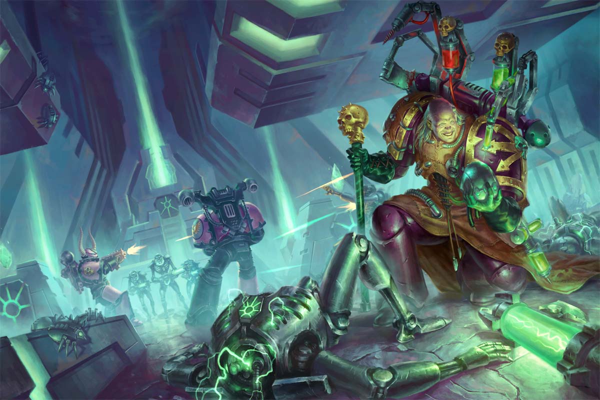
Adeptus Mechanicus
Adrian Smith
|
|
|
 |
|
2024/01/28 00:09:21
Subject: GW's new art direction sucks!
|
|

Ridin' on a Snotling Pump Wagon
|
Different things are different, therefore bad?
|
|
|
|
|
|
2024/01/28 00:37:11
Subject: GW's new art direction sucks!
|
|

Ultramarine Chaplain with Hate to Spare
|
But also some things are worse than others 
I agree with the OP. There's a lot of new art in full color, but the color is often really lousy. Very cartoonish.
|
|
|
|
|
|
2024/01/28 01:04:41
Subject: GW's new art direction sucks!
|
|
Spawn of Chaos
Warhammer 40K Universe
|
Cartoon art doesn't belong to 40K. Sure if you're a fan artist and you have a different approach, however official art should stay Grimdark. Even fan art that I really love, still doesn't capture the dark spectrum. Everything is there except the grimdark.
Here's some fan art that's so good, yet still fails to capture the grimdark
Adiran Smith
 Insectum7 wrote: Insectum7 wrote:But also some things are worse than others
I agree with the OP. There's a lot of new art in full color, but the color is often really lousy. Very cartoonish.
The colors are too bright, it doesn't make sense to be official art.
|
|
|
|
|
2024/01/28 01:11:07
Subject: GW's new art direction sucks!
|
|
Humming Great Unclean One of Nurgle
|
I didn’t know GW had new management.
I wish you the best of luck in getting your art direction changed.
|
Clocks for the clockmaker! Cogs for the cog throne! |
|
|
|
|
2024/01/28 01:33:40
Subject: GW's new art direction sucks!
|
|

Speed Drybrushing
|
So, what you're saying is that because Adrian Smith isn't the sole artist for GW it all sucks? That's kind of a blinkered attitude towards different styles of art, GW have many different styles to appeal to many different people.
|
Not a GW apologist |
|
|
|
|
2024/01/28 01:34:28
Subject: Re:GW's new art direction sucks!
|
|
Dakka Veteran
|
Man, you would hate 2nd Edition era art.
|
|
This message was edited 1 time. Last update was at 2024/01/28 01:35:59
|
|
|
|
|
2024/01/28 02:43:44
Subject: GW's new art direction sucks!
|
|
Ultramarine Chaplain with Hate to Spare
|
Honestly I'll happily take crude black and white art over better rendered, but cartooney colored art.
|
|
|
|
|
|
2024/01/28 07:43:19
Subject: GW's new art direction sucks!
|
|

Pyromaniac Hellhound Pilot
|
Saying the art is bad seems a tad to much to me. Sure colours are a bit too bright and saturated. But overall I like them, apart from the colour I feel they still convey something of mayhem, carnage and stupidly overpowered beings.
Have you ever taken a look at 2nd edition era codices? You'd probably fall unconscious at their mere sight, and apparently it didn't quite threaten 40k Back in the days.
I'll let you that I find the hashtag new40k somewhat cringe though 
|
40k: Necrons/Imperial Guard/ Space marines
Bolt Action: Germany/ USA
Project Z.
"The Dakka Dive Bar is the only place you'll hear what's really going on in the underhive. Sure you might not find a good amasec but they grill a mean groxburger. Just watch for ratlings being thrown through windows and you'll be alright." Ciaphas Cain, probably. |
|
|
|
|
2024/01/28 07:59:57
Subject: GW's new art direction sucks!
|
|
Longtime Dakkanaut
Bamberg / Erlangen
|
I don't think it's just the difference in colour that you prefer. The official ones you like are super detailed. Comparatively, modern 40k art is more "clean" and got a strong digital/computer vibe to it.
|
|
|
|
|
|
2024/01/28 08:05:13
Subject: GW's new art direction sucks!
|
|
Longtime Dakkanaut
|
Adrian's work was all done by hand.
Afaik all modern GW art is digitally rendered and the ones you posted all possess some of the worst aspects of digital, overly bright and too smooth. You can paint digitally in a way that looks like traditional art, but it's generally more involved.
GW's art looks like quick shiny churned out illustrations of exactly each kit sold.
Their older art was traditionally hand produced and was less slaved to the exact design of specific kits on sale, rather allowing the artist to create their own interpretations and work in a more evocative manner (your examples show this clearly, they are representative rather than literal illustrations of models).
|
|
|
|
|
|
2024/01/28 10:00:02
Subject: Re:GW's new art direction sucks!
|
|

Contagious Dreadnought of Nurgle
|
The OP focuses on 8th edition DG artworks. I just took a look at the 9th edition DG codex. These two artworks have gotten more gritty and dark colors in that iteration and there are a couple of new artworks that are more in line with the older stuff.
So it's not a "new art direction" concerning DG, I'd say it was an art direction from 7th and 8th edition.
|
|
This message was edited 2 times. Last update was at 2024/01/28 10:00:54
|
|
|
|
|
2024/01/28 11:51:05
Subject: Re:GW's new art direction sucks!
|
|
Preparing the Invasion of Terra
|
Talk about cherry picking in the OP.
This is the current cover for CSM:
And the current cover for Admech:
And GSC:
The art direction as a whole did change in 8th when things got a bit iffy but there are still some absolutely stellar pieces being put out by GW artists, especially recently.
|
|
|
|
|
2024/01/28 13:14:29
Subject: GW's new art direction sucks!
|
|

Locked in the Tower of Amareo
|
So red sky good, green sky bad.
Got it
|
2024 painted/bought: 109/109 |
|
|
|
|
2024/01/28 13:57:53
Subject: Re:GW's new art direction sucks!
|
|
Impassive Inquisitorial Interrogator
|
 Gert wrote: Gert wrote:Talk about cherry picking in the OP.
This is the current cover for CSM:
And the current cover for Admech:
And GSC:
The art direction as a whole did change in 8th when things got a bit iffy but there are still some absolutely stellar pieces being put out by GW artists, especially recently.
For once we agree! Lewis Jones has done a stellar job capturing that old school gritty look. I just hope we get more like it and GW lets the man cook. Because the OP is right in that for a while we've had some very clean, saturated art rather than stuff with real grit.
|
|
|
|
|
2024/01/28 13:59:13
Subject: Re:GW's new art direction sucks!
|
|
Longtime Dakkanaut
|
|
|
|
|
|
2024/01/28 14:20:44
Subject: GW's new art direction sucks!
|
|
Pyromaniac Hellhound Pilot
|
This meme is cursed man
|
40k: Necrons/Imperial Guard/ Space marines
Bolt Action: Germany/ USA
Project Z.
"The Dakka Dive Bar is the only place you'll hear what's really going on in the underhive. Sure you might not find a good amasec but they grill a mean groxburger. Just watch for ratlings being thrown through windows and you'll be alright." Ciaphas Cain, probably. |
|
|
|
|
2024/01/28 19:41:06
Subject: Re:GW's new art direction sucks!
|
|
Furious Fire Dragon
UK
|
The "new" stuff you list in your OP is mostly 7 year old pieces.
I feel like you missed all of the 9th edition art. Maybe you should check it out.
|
Nazi punks feth off |
|
|
|
|
2024/01/28 21:48:34
Subject: Re:GW's new art direction sucks!
|
|
Insect-Infested Nurgle Chaos Lord
|
Gert wrote:Talk about cherry picking in the OP.
This is the current cover for CSM:
And the current cover for Admech:
And GSC:
The art direction as a whole did change in 8th when things got a bit iffy but there are still some absolutely stellar pieces being put out by GW artists, especially recently.
So are you.  As those are all pieces by Lewis Jones, AKA, the one person that actually gets that you don't just draw the models in art form, rendering the entire exercise pointless and tepid as there is zero imagination shown. Oh look, there's yet more new artwork that is literally the models you can buy in the box. Which is also retroactively affecting older artwork with younger members of this hobby, who have been conditioned by GW to only think that what they see in the artwork is things you can buy, and not a larger tapestry of a much more expansive universe, for them to explore themselves in conversions and such. Not a day goes by on Reddit etc. without someone seeing a piece from the 90s and asking "wHaT mOdEl Is ThIS?" without understanding that was not how GW operated back then. The artwork was there to inspire you, to get you to create things for your guys, not to be a 1:1 replica of things you can buy with zero imagination to it. I cannot take seeing yet another post asking what bloody faction the Magos on the front of the GSC codex is. Yes, he has puffy sleeves like a Landschneckt, the model does not. Use your effing brain!
It got so bad, that when GW put that unknown xenos piece in the 9th ed book (also by Lewis Jones), people went all giddy over it thinking it was a dump of new models, not understanding it was just a flavour piece showing that the galaxy is a huge place full of "here be dragons". But that is what happens when you tell your newer audience one thing for years and then rug pull them with the heir to Blanche's throne. Automatically Appended Next Post:  Bosskelot wrote: Bosskelot wrote:The "new" stuff you list in your OP is mostly 7 year old pieces.
I feel like you missed all of the 9th edition art. Maybe you should check it out.
7 years old is still new in the context of a 37 year old game.
|
|
This message was edited 1 time. Last update was at 2024/01/28 21:53:17

Games Workshop Delenda Est.
Users on ignore- 53.
If you break apart my or anyone else's posts line by line I will not read them. |
|
|
|
|
2024/01/28 23:32:24
Subject: GW's new art direction sucks!
|
|
Fixture of Dakka
|
While I do miss the charm of a lot of the old black & white art, I don't feel the need to tear down the newer stuff. It all looks good in its own way.
|
ATTENTION. Psychic tests are unfluffy. Your longing for AV is understandable but misguided. Your chapter doesn't need a separate codex. Doctrines should go away. Being a "troop" means nothing. This has been a cranky service announcement. You may now resume your regularly scheduled arguing.
|
|
|
|
|
2024/01/29 07:53:18
Subject: Re:GW's new art direction sucks!
|
|
Dakka Veteran
|
Well, there's also pieces like this Ancient by longtime favorite Paul Dainton. It's not all "cartoony" or "the exact models as sold by GW".
|
|
|
|
|
|
2024/01/29 08:30:16
Subject: Re:GW's new art direction sucks!
|
|
Posts with Authority
|
This sums up the Internet in 2024
Also, exalted for Greatness
|
|
|
|
|
2024/01/29 08:49:42
Subject: GW's new art direction sucks!
|
|
Battlefield Tourist
|
While I agree subjectively with the OP, I don't really care for the new art because it looks very much like all the rest of the art produced for mainstream fantasy games in a way that doesn't satisfy me, I think we've gotta be self aware about it.
When we got into the hobby we were younger and things we saw made a much bigger impression on us. Now we're jaded and new things don't give us as much of a reaction. That doesn't mean the old stuff we remember and are nostalgic for is always better than the new stuff that leaves us cold. I love black and white line art even more than full colour for all my fantasy gaming art, but that doesn't mean black and white line art is always better than colour art. It's just that I grew up reading black and white art in 2000AD comics as a kid, and move into black and white GW art from there, so it has a stronger impact on me than modern art styles. The kids right now will look back on this style with nostalgia in 20 years.
|
|
|
|
|
|
2024/01/29 09:41:16
Subject: Re:GW's new art direction sucks!
|
|

Angered Reaver Arena Champion
|
In my humble opinion this is the correct answer.
Both good.
|
|
|
|
|
2024/01/29 17:41:07
Subject: GW's new art direction sucks!
|
|
Longtime Dakkanaut
London
|
I think the biggest change is the use of computers and the pressure to churn out a lot more art for lower prices. No doubt AI elements will increasingly be used as well. The money paid means you simply can't take 'art' levels of time over an image. That 'cleaner' look is one consequence. It is hard to get the same sort of horror the old pieces have, because the pressures on artists have changed.
|
|
|
|
|
2024/01/29 18:36:40
Subject: GW's new art direction sucks!
|
|
Preparing the Invasion of Terra
|
Maybe, maybe not. Unlike certain companies who have been caught like 8 times already using AI, GW artists seem to have either been really good at hiding it or haven't used it yet.
Maybe because they're in-house and not commissioned?
Then again, the horrors of AI art could actually be useful for the likes of Chaos gribblies.
|
|
This message was edited 1 time. Last update was at 2024/01/29 18:37:15
|
|
|
|
|
2024/01/29 19:35:12
Subject: GW's new art direction sucks!
|
|
Killer Klaivex
The dark behind the eyes.
|
Gert wrote:Maybe, maybe not. Unlike certain companies who have been caught like 8 times already using AI, GW artists seem to have either been really good at hiding it or haven't used it yet.
GW - 'Don't worry, we only use real artists for our images.'
The real artists, depicting the "Master of Blades":
|
 blood reaper wrote: blood reaper wrote:I will respect human rights and trans people but I will never under any circumstances use the phrase 'folks' or 'ya'll'. I would rather be killed by firing squad.
 the_scotsman wrote: the_scotsman wrote:Yeah, when i read the small novel that is the Death Guard unit options and think about resolving the attacks from a melee-oriented min size death guard squad, the thing that springs to mind is "Accessible!"
 Argive wrote: Argive wrote:GW seems to have a crystal ball and just pulls hairbrained ideas out of their backside for the most part.
 Andilus Greatsword wrote: Andilus Greatsword wrote:
"Prepare to open fire at that towering Wraithknight!"
"ARE YOU DAFT MAN!?! YOU MIGHT HIT THE MEN WHO COME UP TO ITS ANKLES!!!"
Akiasura wrote:I hate to sound like a serial killer, but I'll be reaching for my friend occam's razor yet again.
 insaniak wrote: insaniak wrote:
You're not. If you're worried about your opponent using 'fake' rules, you're having fun the wrong way. This hobby isn't about rules. It's about buying Citadel miniatures.
Please report to your nearest GW store for attitude readjustment. Take your wallet.
|
|
|
|
|
2024/01/29 20:25:19
Subject: Re:GW's new art direction sucks!
|
|

Stormin' Stompa
|
Maybe GW should let artists put their names on their works. It's hard to talk about art direction when a company is viewed as a monolith rather than a complex web of artist and businessmen.
There are going to artists of varying quality over the years and I'm I could make a list of subpar art from over years.
|
Ask yourself: have you rated a gallery image today? |
|
|
|
|
2024/01/29 20:32:51
Subject: Re:GW's new art direction sucks!
|
|
[MOD]
Making Stuff
|
I'm a little puzzled at the 'literally just a green background' claim on the Plague Marine picture. There's quite a lot of detail in that background.
 Mr Nobody wrote: Mr Nobody wrote:Maybe GW should let artists put their names on their works. It's hard to talk about art direction when a company is viewed as a monolith rather than a complex web of artist and businessmen.
There are going to artists of varying quality over the years and I'm I could make a list of subpar art from over years.
This is very much the thing. GW have always used a range of artists, with a range of different styles and skillsets. While different editions of 40K have had their own overall 'feel', the artwork has always ranged from the super detailed, gritty stuff to clean and more cartoony styles.
The current 40K logo, though... that can get in the bin.
|
|
|
|
|
|
2024/01/29 23:14:30
Subject: GW's new art direction sucks!
|
|
Longtime Dakkanaut
|
 F.E.A.R. wrote: F.E.A.R. wrote:
Cartoon art doesn't belong to 40K. Sure if you're a fan artist and you have a different approach, however official art should stay Grimdark. Even fan art that I really love, still doesn't capture the dark spectrum. Everything is there except the grimdark.
Here's some fan art that's so good, yet still fails to capture the grimdark
Adiran Smith
Insectum7 wrote:But also some things are worse than others
I agree with the OP. There's a lot of new art in full color, but the color is often really lousy. Very cartoonish.
The colors are too bright, it doesn't make sense to be official art.
Why not? The setting's already a massive cartoon.
|
|
This message was edited 1 time. Last update was at 2024/01/29 23:14:50
|
|
|
|
|
|
|


 Eldar
Eldar  Imperial Guard
  Space Marines