Forum adverts like this one are shown to any user who is not logged in. Join us by filling out a tiny 3 field form and you will get your own, free, dakka user account which gives a good range of benefits to you:
No adverts like this in the forums anymore.
Times and dates in your local timezone.
Full tracking of what you have read so you can skip to your first unread post, easily see what has changed since you last logged in, and easily see what is new at a glance.
Email notifications for threads you want to watch closely.
Being a part of the oldest wargaming community on the net.
If you are already a member then feel free to login now.
2022/11/06 04:03:00
Subject: Re:Xpress Color - Vallejo entering the Contrast/Speedpaints game? (New Game Color Review - pg. 6)
Kalamadea wrote: Nobody should be clicking on Spikeybits articles, EVER! they're clickbait at the best of times, and this is the worst kind
I hope Xpress come out soon, I'm tired of hearing how they'll revolutionize the industry again just like the last 7 brands have "revolutionized" the industry, but then I'm always looking to add more paints to my bag o tricks
I don't think they're going to especially "revolutionise" anything. They will add more colours to my palette of this style of paint though. Any behavioural differences (aside from reactivation! ) that they have will just make them better or worse for certain things/effects
I think something revolutionary could be if they have a long enough drying time and a favourable consistency to blend them.
I played around blending the AP paints and it wasn't as easy as I hoped it would be, while Contrast paints dry too fast to try anything like that.
This message was edited 1 time. Last update was at 2022/11/06 04:03:14
2022/11/06 04:14:13
Subject: Re:Xpress Color - Vallejo entering the Contrast/Speedpaints game? (New Game Color Review - pg. 6)
Orlanth wrote: Insaniak, mentioning Speedpaint and Contrast here is fair, so long as it is in cross reference to this new product, in quality, availability, or value for money.
Naturally we do not have too much to say at the moment, but if this thread lives long enough people will be wanting to post comparisons and personal experiences. I hope you see fit to review your dictat at that time.
Gotta agree with Orlanth again. They're all relevant as they are all variations on a (relatively new) theme or have a relevance to the discussion - just as Orlanth and I discussing Raler-Downey Ink naming conventions when compared to Vallejo's is. And even Ghaz posting a link to a video that's for a different product (even if it is from the same company!)
Yes, to be clear - discussion comparing the different ranges is valid. Discussion specifically about a given range, like Speedpaint's reactivation issue, is better done in the relevant thread.
2022/11/06 04:56:36
Subject: Re:Xpress Color - Vallejo entering the Contrast/Speedpaints game? (New Game Color Review - pg. 6)
Note thaf the original post does mention ‘new Game Color’ paints. It wasn’t until some time later that we learned that it was a reworking of the entire line. That is why they were not mentioned in the thrred title due to limited space but they were always a part of the discussion in this thread.
'It is a source of constant consternation that my opponents cannot correlate their innate inferiority with their inevitable defeat. It would seem that stupidity is as eternal as war.'
- Nemesor Zahndrekh of the Sautekh Dynasty Overlord of the Crownworld of Gidrim
2022/11/06 10:01:29
Subject: Xpress Color - Vallejo entering the Contrast/Speedpaints game? (New Game Color Review - pg. 6)
I hope the expanded range of Xpress Colours have more skintones / earthtones. They're absolutely my most used colour family.
Did anyone else find that new metallics video extremely distracting with the constant picture-in-a-picture clips? Gave up and skipped to the end to see what the final result would be and it doesn't look bad at all. Wonder how they'll stack up against Metal Colors.
To add to the colour naming convention pile, P3 did a rather cheeky runaround the whole issue by naming their fleshtones with in-game factions like Idrian Flesh and Khardic Flesh.
2022/11/06 11:01:35
Subject: Re:Xpress Color - Vallejo entering the Contrast/Speedpaints game? (New Game Color Review - pg. 6)
Game colour review is totally on topic and what I expect to see on this topic what I dont expect to see and has been flagged by mods too is
- Speedpaints and the other ridiculous site.
So yes I come here for the VGC and Xpress since both of these are the new offers from Vallejos.
ITS GREAT you guys use dips and stuff from other brands but open those debates on other treads please. Its difficult to go through a thread about Vallejo when you keep flooding it with whatever alternatives floats your boat post spam!
I bought all of the Antithesis range. They're ...usable, but not my favourites to use. I'm happy to pay a little more for Contrast, and have picked up the GSW Dipping Inks. I'll buy the Vallejo when they come out, and if the new/reformulated Army Painted ones actually don't reactivate, I might even pick them up as well. Maybe. .
I decided not to buy Warcolours as their formatting led to an all or nothing approach, if I buy blue 5, I will get the itch to buy blue 1-4. I dont want that itch. I was going to make an exception for Antithesis, but then Speedpaint was on special offer and I bought the Speedpaint Mage Set twice.
Warcolours is a small Cypriot company and access is lobsided, so I mention them to keep the option alive.
I bought my army Painter and Citadel paints from Alchemist Workshop in the UK, decent level of discount, topped up both from covid stock of e-businesses going under, some at high discount.. I bought Vallejo from Griffin Gaming. I bought the entire Contrast range from Alchemist relatively early, and when the range was expanded, post getting all the Speedpaints, twice, I paid for the upgrade bundle.
Steep entry to complete the range, and frankly by this stage is was completionism. But I was quickly glad I did. Full range of Contrast and Speedpaint grants a high palette of anything other than metals. Oddly enough I rarely use them for intended purpose, but over a single basecoat to replace layering.
I will be buying the new Xpress Color, and likely buy the lot because that is how I roll. Is that necessary, likely not, but it will widen the palette. The problem I might encounter is that I will have to think carefully over existing projects. I am working through my WHFB armies, painfully slowly, and if I start a faction with Speedpaint or Contrast, can I afford to retire either from my repertoire in favour of Xpress Color? I don't think so. We know nothing about mixing yet and the existing colour ranges do not overlap, each companies colours are subtlely different, I expect Xpress Color to have the same issue. At least with Old Citadel, (I still have some), Game Color and Army Painter main paint range there is a lot of overlap, I can start an army with Ultramarines Blue, Mithril Silver, Chaos Black and Goblin green base, 90's style and finish/add to/touch up the same army today with Army Painter and Vallejo Game Color alternatives. I don't think the same will be true of Contrast painted minis. I suspect it will be an all or nothing.
Agreed! Juan - feth those guys. Perhaps you can get more followers out of this childish behaviour as Naomi/Sword & Steele did a year or two ago. I'd never heard of her before that, but Steisland Effect and now I'm a subscriber.
I was completely unaware that Sword & Steele were having trouble, I subscribed long ago, but dont watch them often.
The original fleshing out of the Salamanders chapter had them with dark brown skin before that was reconned into coal black in what I thought was a rather baffling move.
The original Salamanders were blonde hair aryan types, or maybe that was just the officers. Consider the optics of that.
I much prefered the Vulcan was African to Vulcan was alienesque. As the Imperium is mostly Caucasian soup, it makes more sense for those who go it alone and have a distinctly different moral culture to also be ethnically distinct, either African, or Norse etc. It might be just enough to keep the bullgak away.
Back in the day I used to use WInsdor & Newton inks for washes and what we'd now call contrast. I found out about the Daler Rowney via Les Bursley's "make your own washes" tutorial here on Dakka over a decade ago (and they're good, as you know!) https://www.dakkadakka.com/dakkaforum/posts/list/261541.page
Thanks for the vid link - I'll check it out later. Vince has some good stuff in his vids.
I discovered by own form of Contrast two decades back, I called it the Dark Pastel technique, it was extremely crude.
The name had meaning, the baseline formula was one part paint, one part black paint and two parts water. I called that the baseline as you had to then add any of the three to the mix from baseline to get the colour with a workable consistency.
I called it Dark Pastel because the paint was diluted down to a pastel watercolour consistency by water dilution then brought back down in tone via the black paint.
Results were very mixed, it worked well on scales and fur, badly on flat surfaces, it worked well with Citadel Blood Red and other select colours, badly with any yellow.
I did the Descent Journey in the Dark dragons in under ten minutes each, to well above tabletop quality. I still have them.
I took my technique to Salute in 2008 and IIRC 2009 and talked about it. I found a new technique, so share. I made it clear that it does work but only on certain conditions, however when it does work it is transformative, and makes a excellent cover with minimal time and layering with only modest skill (I am an average painter, but a good innovator). It was absorbed as a selective technique, excellent in a narrow range of paint and surface combinations. The clincher was the ability to get excellent results quickly, with minimal skill, an eye opener.
I still wonder if this was the pebble that got the Contrast avalanche rolling. Citadel were there.
I did have some inks, from the old 80's Citadel dropper bottles, I still have about half left, I did use them for a boost, but did not record exact composition. Never though to entirely replace the heavy water dilution with them though but relied on the 50% black to do the job.
I don't think it's realistic that Vallejo will dedicate 1/4 of their new line to earth tones.
I do.
Let us start with four human flesh tones, which is the compromise position I am reading in the thread. Light, medium, dark and ruddy.
Then add bone and sand for six.
Bark, leather, and two soils a clay brown and a light grey brown for ten.
I think that leaves ample room if we limit to 40, which we are not.
Six 'heraldic' colour wheel colours.
Four other variations each of blue, red, and green.
A swatch of four camo colours (also mostly green and grey green)
Black, white and three greys.
A second purple, second yellow and a second orange.
That is forty.
We need some cross colours like aquamarine/turquoise which we can pad out with, maybe a third yellow.
Easily doable. However what we see often is a vast range of reds, nice colours to be sure but largely wasteful in the range. Browns are boring, but a wider range of earthtones is in my opinion essential.
But I also got a hot tip, so counter intuitive I would never have guessed it. When painting a very dark skin African, like a Zulu or West African, undercoat in green and paint straight over the green with a suitable dark brown paint, Dryad Bark is recommended for this. The combo makes it more real. I was shown pictures of some Zulus painted this way.
Very interesting. What lightness and intensity of green are we talking about as recommended to use? You can reference the citadel colour palette for an answer, since it's easly found/referenced by most people. Dryad Bark is a dark brown, though...?
I am sorry but I don't remember where I put the notebook I took to Salute. is. I took down notes. I do remember the Dryad Bark was specific, but also specific to Zulus, who are darker than most Africans. IIRC the exact green is actually less important, I do vaguely remember then saying so to me asking the same question as you.
Spoiler:
But last night I stumbled on a clue when looking at info on ancient colour palettes for a post on the Speedpaint thread.
The renaissance old masters used green as an undercoat for human flesh, and this was presumably more often Caucasian too.
A lot of renaissance era art was unfinished and we have undercoated angels on church walls and canvasses in vaults. With green faces.
Incomplete art was a big issue back then, the better the artist the more work they got and the more work they got the more work they started to secure the income stream, and consequently the less they finished.
On aside there are also here are a lot of 'captures' in vaults under medieval Italian cities, captures are half completed sculptures.
Michelangelo had and still has a particularly impressive Pile of Shame. Here is one of his minis left on the sprue.
So don't feel bad.
Back to your question, try an ordinary modest earthy green.
Plaguebearer maybe.
This message was edited 3 times. Last update was at 2022/11/06 14:14:01
n'oublie jamais - It appears I now have to highlight this again.
It is by tea alone I set my mind in motion. By the juice of the brew my thoughts aquire speed, my mind becomes strained, the strain becomes a warning. It is by tea alone I set my mind in motion.
2022/11/06 16:47:46
Subject: Re:Xpress Color - Vallejo entering the Contrast/Speedpaints game? (New Game Color Review - pg. 6)
At Games Workshop, we believe that how you behave does matter. We believe this so strongly that we have written it down in the Games Workshop Book. There is a section in the book where we talk about the values we expect all staff to demonstrate in their working lives. These values are Lawyers, Guns and Money.
2022/11/07 16:56:09
Subject: Re:Xpress Color - Vallejo entering the Contrast/Speedpaints game? (New Game Color Review - pg. 6)
Another review of the new Game Color paints from Adeptus Stammtisch. Starting at about the 10:45 mark he tests the reformulated Dead White over red and it looks like it has good coverage (unfortunately it's not the best shot):
'It is a source of constant consternation that my opponents cannot correlate their innate inferiority with their inevitable defeat. It would seem that stupidity is as eternal as war.'
- Nemesor Zahndrekh of the Sautekh Dynasty Overlord of the Crownworld of Gidrim
2022/11/08 08:40:22
Subject: Re:Xpress Color - Vallejo entering the Contrast/Speedpaints game? (New Game Color Review - pg. 6)
Kalamadea wrote: Nobody should be clicking on Spikeybits articles, EVER! they're clickbait at the best of times, and this is the worst kind
I hope Xpress come out soon, I'm tired of hearing how they'll revolutionize the industry again just like the last 7 brands have "revolutionized" the industry, but then I'm always looking to add more paints to my bag o tricks
I don't think they're going to especially "revolutionise" anything. They will add more colours to my palette of this style of paint though. Any behavioural differences (aside from reactivation! ) that they have will just make them better or worse for certain things/effects
I think something revolutionary could be if they have a long enough drying time and a favourable consistency to blend them.
I played around blending the AP paints and it wasn't as easy as I hoped it would be, while Contrast paints dry too fast to try anything like that.
I do a little bit of (simple) blending (undead flesh tones) using Citadel Contrasts on a regular basis. The keys to doing so havce been using contrast medium and (occasionally) a touch of drying retarder. GSW's Dipping Inks also play nicely using this method, so I'd assume at the very least, Vallejo's Xpress would work using this sort of method. It's obviously not the same as blending traditional paints, Much more dropping some medium into the middle, then doing your blue and blending that into the medioum in the middle, then quickly doing the same with your red on the other side and then essentially mixing them to taste in the central area.
I do a little bit of (simple) blending (undead flesh tones) using Citadel Contrasts on a regular basis. The keys to doing so havce been using contrast medium and (occasionally) a touch of drying retarder. GSW's Dipping Inks also play nicely using this method, so I'd assume at the very least, Vallejo's Xpress would work using this sort of method. It's obviously not the same as blending traditional paints, Much more dropping some medium into the middle, then doing your blue and blending that into the medioum in the middle, then quickly doing the same with your red on the other side and then essentially mixing them to taste in the central area.
That sounds like a lot of faff, goes against the principle of Contrast frankly.
I do abuse contrast as a function by painting over a single, sometimes double basecoat and use the fluidity of Contrast to do secondary layering, but that is still a Contrast method. I don't however want the watercolour effect that a Contrast over undercoat has.
I do not expect Xpress Colour to differ in application.
However due to its quirks Speedpaint does, once the reactivation 'issue' is fixed I will have to label my current Speedpaints against any future Speedpaints, the ones that do a once over and the ones that have a longer work time and support blending. So long as I keep a sufficient stock of the current Speedpaint and renew, and above all relabel or otherwise mark the old bottles. So I have two choices per colour, a speedy once over or a mixer paint of the same hue. I think this could end up a colossal advantage.
I wonder if Vallejo could profit from Army Painters error and do a line of Xpress Colour Worktime, a retardant that you add a drop to on the palette, and load on your brush before dabbing in the paint. I think blending on the palette detracts from what Contrast style paints do, however loading a brush with some Xpress paint that works like current reactivating Speedpaint, then applying a completely different colour (without retarder) so you can blend on the model as you go.
Please remember that Speedpaint reactivation doesn't remove its 'Contrast paint style' credentials, it endangers colourfastness. If you don't desire colourfastness but want to blend while 'Contrasting' it is very versatile. This is why I tag team Contrast and Speedpaint, and will add Xpress to the tag team, but alongside the Contrast as one paint range on grounds of post application dynamics. Trouble here is that there is no palette overlap, so I can have one red that stays and another red that blends but cant switch roles. Mark my words there will soon come a day when hobbyists with new Speedpaint will be looking for old Speedpaint for blending because having two types of the same colour will be so so useful. I hope the label is distinctively different between the two.
n'oublie jamais - It appears I now have to highlight this again.
It is by tea alone I set my mind in motion. By the juice of the brew my thoughts aquire speed, my mind becomes strained, the strain becomes a warning. It is by tea alone I set my mind in motion.
2022/11/08 14:12:10
Subject: Re:Xpress Color - Vallejo entering the Contrast/Speedpaints game? (New Game Color Review - pg. 6)
Kalamadea wrote: Nobody should be clicking on Spikeybits articles, EVER! they're clickbait at the best of times, and this is the worst kind
I hope Xpress come out soon, I'm tired of hearing how they'll revolutionize the industry again just like the last 7 brands have "revolutionized" the industry, but then I'm always looking to add more paints to my bag o tricks
I don't think they're going to especially "revolutionise" anything. They will add more colours to my palette of this style of paint though. Any behavioural differences (aside from reactivation! ) that they have will just make them better or worse for certain things/effects
I think something revolutionary could be if they have a long enough drying time and a favourable consistency to blend them.
I played around blending the AP paints and it wasn't as easy as I hoped it would be, while Contrast paints dry too fast to try anything like that.
I do a little bit of (simple) blending (undead flesh tones) using Citadel Contrasts on a regular basis. The keys to doing so havce been using contrast medium and (occasionally) a touch of drying retarder. GSW's Dipping Inks also play nicely using this method, so I'd assume at the very least, Vallejo's Xpress would work using this sort of method. It's obviously not the same as blending traditional paints, Much more dropping some medium into the middle, then doing your blue and blending that into the medioum in the middle, then quickly doing the same with your red on the other side and then essentially mixing them to taste in the central area.
You're better than me if you manage to blend with contrast before it starts to dry. I guess on small areas I could do what you describe, but on most models I struggle to get the area coated and clean up pools without coffee staining, let alone trying to blend.
It probably also matters what colours are being blended, I found blending a dark colour into a light colour or vice versa was easier than trying to blend two colours of similar brightness level.
Will have to try the drying retarder, which one do you use? Does it affect the properties much?
I do a little bit of (simple) blending (undead flesh tones) using Citadel Contrasts on a regular basis. The keys to doing so havce been using contrast medium and (occasionally) a touch of drying retarder. GSW's Dipping Inks also play nicely using this method, so I'd assume at the very least, Vallejo's Xpress would work using this sort of method. It's obviously not the same as blending traditional paints, Much more dropping some medium into the middle, then doing your blue and blending that into the medioum in the middle, then quickly doing the same with your red on the other side and then essentially mixing them to taste in the central area.
That sounds like a lot of faff, goes against the principle of Contrast frankly.
I do abuse contrast as a function by painting over a single, sometimes double basecoat and use the fluidity of Contrast to do secondary layering, but that is still a Contrast method. I don't however want the watercolour effect that a Contrast over undercoat has.
I do not expect Xpress Colour to differ in application.
However due to its quirks Speedpaint does, once the reactivation 'issue' is fixed I will have to label my current Speedpaints against any future Speedpaints, the ones that do a once over and the ones that have a longer work time and support blending. So long as I keep a sufficient stock of the current Speedpaint and renew, and above all relabel or otherwise mark the old bottles. So I have two choices per colour, a speedy once over or a mixer paint of the same hue. I think this could end up a colossal advantage.
I wonder if Vallejo could profit from Army Painters error and do a line of Xpress Colour Worktime, a retardant that you add a drop to on the palette, and load on your brush before dabbing in the paint. I think blending on the palette detracts from what Contrast style paints do, however loading a brush with some Xpress paint that works like current reactivating Speedpaint, then applying a completely different colour (without retarder) so you can blend on the model as you go.
Please remember that Speedpaint reactivation doesn't remove its 'Contrast paint style' credentials, it endangers colourfastness. If you don't desire colourfastness but want to blend while 'Contrasting' it is very versatile. This is why I tag team Contrast and Speedpaint, and will add Xpress to the tag team, but alongside the Contrast as one paint range on grounds of post application dynamics. Trouble here is that there is no palette overlap, so I can have one red that stays and another red that blends but cant switch roles. Mark my words there will soon come a day when hobbyists with new Speedpaint will be looking for old Speedpaint for blending because having two types of the same colour will be so so useful. I hope the label is distinctively different between the two.
I'm hoping when AP "fixes" the reactivation, they don't reduce the drying time.
But we'll have to see where Vallejo falls into the mix.
Juan saying it mixes well with water gives me hope it'll play better with different mediums than Contrast does.
This message was edited 2 times. Last update was at 2022/11/08 14:17:26
2022/11/08 20:30:58
Subject: Xpress Color - Vallejo entering the Contrast/Speedpaints game? (New Game Color Review - pg. 6)
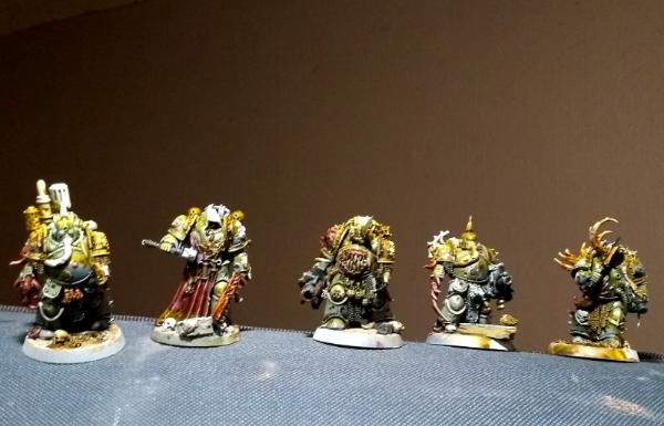
I have only really tried wet-blending contrast on minis that are OK to look a bit messy anyway, like these work-in-progress plague marines -- again the medium helped.
This message was edited 2 times. Last update was at 2022/11/08 20:32:26
Another video from Angel Giraldez where he will "teach you ALL the SECRETS of the NEW GAME COLOR" (as long as you speak Spanish ).
'It is a source of constant consternation that my opponents cannot correlate their innate inferiority with their inevitable defeat. It would seem that stupidity is as eternal as war.'
- Nemesor Zahndrekh of the Sautekh Dynasty Overlord of the Crownworld of Gidrim
2022/11/09 06:34:32
Subject: Re:Xpress Color - Vallejo entering the Contrast/Speedpaints game? (New Game Color Review - pg. 6)
That sounds like a lot of faff, goes against the principle of Contrast frankly.
I do abuse contrast as a function by painting over a single, sometimes double basecoat and use the fluidity of Contrast to do secondary layering, but that is still a Contrast method. I don't however want the watercolour effect that a Contrast over undercoat has.
I do not expect Xpress Colour to differ in application.
It's fine. it's me playing with my new(ish) paints in a way that works for me. I don't often use contrast in the "official" way of "drop contrast colour over white/grey/bone/etc, maybe add a highlight and call it a day." precisely because I don't like the watercolour effects that you describe, so I give zero amount of feths about the "principle" of contrast. They're just paints. Just another tool. I mix them with different mediums from different manufacturers (including drying retarder, when appropriate), mix them across manufactuers, and mix them with paints. Sometimes for a specific effect and sometimes for experimentation and because a boardgame model of chaos mutie or poxwalker makes a great guinea pig because it only "needs" to look so good - so I can learn what happens when X mixes with Y and is used over Z.
You're better than me if you manage to blend with contrast before it starts to dry. I guess on small areas I could do what you describe, but on most models I struggle to get the area coated and clean up pools without coffee staining, let alone trying to blend.
It probably also matters what colours are being blended, I found blending a dark colour into a light colour or vice versa was easier than trying to blend two colours of similar brightness level.
Will have to try the drying retarder, which one do you use? Does it affect the properties much?
Not noticably, but remember, I'm doing things like blending areas of zombie skin on models that support that sort of contrast use via their anatomical details/textures in pursuit of discordant discolouration and going from, purple to green (for example), or doing stuff with magical effects on Endless Spells or whatnot. I'm not blending from blue to green on a Space Marine Captain's smooth, long cloak where it needs to be perfect. The other thing is that I'm almost always thinning my Contrasts with Contrast Medium, so adding a touch of (Vallejo in the most recent case, but I've also used Derivan) Drying Retarder doesn't really change much in terms of the "contrast effect" from the already diluted-by-medium pigments/stains.
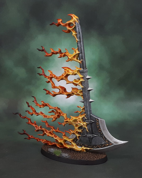
Here's an example of yellow to orange to red to dark red using the abovbe method.
Spoiler:
Edit - GD quote tags!
This message was edited 3 times. Last update was at 2022/11/09 06:46:24
Angel latest video is quite good to talk about the new Gamecolour.
So the formula been upgraded so that all colours have a good coverage and finish matt. ( previous range was inconsistent in that regards)
You have base colour which is thicker and then shadow and highlight colours that are slightly less thick so you can blend them in easier.
Drying time is larger which allows you blend things better.
Displayed the difference between vallejoinks and the Xpress in regards that inks are less saturated and something to be used differently than X range. ( check plague marine at the end to check that)
A total of 80 Game colours.
Thats what I recall there.
Edit- Oh the metallics now are quite fluid and liquid and with amazing coverage.
This message was edited 2 times. Last update was at 2022/11/09 11:14:04
NAVARRO wrote: Angel latest video is quite good to talk about the new Gamecolour.
So the formula been upgraded so that all colours have a good coverage and finish matt. ( previous range was inconsistent in that regards)
You have base colour which is thicker and then shadow and highlight colours that are slightly less thick so you can blend them in easier.
Drying time is larger which allows you blend things better.
Displayed the difference between vallejoinks and the Xpress in regards that inks are less saturated and something to be used differently than X range. ( check plague marine at the end to check that)
A total of 80 Game colours.
Thats what I recall there.
Edit- Oh the metallics now are quite fluid and liquid and with amazing coverage.
The entirety of the new Game Color line can be seen HERE. 80 Game Color paints, 9 Game Color Metallics, 12 Game Color Inks (including a white ink), 8 Game Color Fluorescents, 8 Game Color Washes, 12 Game Color Special FX paints and 7 auxiliary products.
'It is a source of constant consternation that my opponents cannot correlate their innate inferiority with their inevitable defeat. It would seem that stupidity is as eternal as war.'
- Nemesor Zahndrekh of the Sautekh Dynasty Overlord of the Crownworld of Gidrim
2022/11/09 16:57:46
Subject: Re:Xpress Color - Vallejo entering the Contrast/Speedpaints game? (New Game Color Review - pg. 6)
NAVARRO wrote: Angel latest video is quite good to talk about the new Gamecolour.
So the formula been upgraded so that all colours have a good coverage and finish matt. ( previous range was inconsistent in that regards)
You have base colour which is thicker and then shadow and highlight colours that are slightly less thick so you can blend them in easier.
Drying time is larger which allows you blend things better.
Displayed the difference between vallejoinks and the Xpress in regards that inks are less saturated and something to be used differently than X range. ( check plague marine at the end to check that)
A total of 80 Game colours.
Thats what I recall there.
Edit- Oh the metallics now are quite fluid and liquid and with amazing coverage.
The entirety of the new Game Color line can be seen HERE. 80 Game Color paints, 9 Game Color Metallics, 12 Game Color Inks (including a white ink), 8 Game Color Fluorescents, 8 Game Color Washes, 12 Game Color Special FX paints and 7 auxiliary products.
Yes and hopefully we will get a box set with all the regular 80 as usual. I would then just add metallics and call it done. Im not totally sure if Xpress is for my style of painting. I mean I can add depth to the normal paint but the moment you wash all the mini with Xpress you lose control on the original opaque tone.
NAVARRO wrote: Yes and hopefully we will get a box set with all the regular 80 as usual. I would then just add metallics and call it done. Im not totally sure if Xpress is for my style of painting. I mean I can add depth to the normal paint but the moment you wash all the mini with Xpress you lose control on the original opaque tone.
Wouldn't that be the boxed set he's holding in the video thumbnail? By my count it has space for exactly 80 paints.
'It is a source of constant consternation that my opponents cannot correlate their innate inferiority with their inevitable defeat. It would seem that stupidity is as eternal as war.'
- Nemesor Zahndrekh of the Sautekh Dynasty Overlord of the Crownworld of Gidrim
2022/11/14 02:39:11
Subject: Xpress Color - Vallejo entering the Contrast/Speedpaints game? (New Game Color Review - pg. 6)
Fire_Forever wrote: I hope the expanded range of Xpress Colours have more skintones / earthtones. They're absolutely my most used colour family.
To add to the colour naming convention pile, P3 did a rather cheeky runaround the whole issue by naming their fleshtones with in-game factions like Idrian Flesh and Khardic Flesh.
Oh, I use lots of them as well, along with greys and reds/red-browns. I just don't see the nascent line having 5 named skin tones or that many earth tones off the bat. They do want/need to sell them to people selling Space Marines and Stormcast, after all. On the P3 lines - I did like that as well - and picked up a fair few (all?) of them myself some years ago!
NAVARRO wrote: Yes and hopefully we will get a box set with all the regular 80 as usual. I would then just add metallics and call it done. Im not totally sure if Xpress is for my style of painting. I mean I can add depth to the normal paint but the moment you wash all the mini with Xpress you lose control on the original opaque tone.
Wouldn't that be the boxed set he's holding in the video thumbnail? By my count it has space for exactly 80 paints.
I would like a special set of 160 over two boxes, because completionism.
This message was edited 1 time. Last update was at 2022/11/14 02:46:53
n'oublie jamais - It appears I now have to highlight this again.
It is by tea alone I set my mind in motion. By the juice of the brew my thoughts aquire speed, my mind becomes strained, the strain becomes a warning. It is by tea alone I set my mind in motion.
2022/11/14 02:51:12
Subject: Xpress Color - Vallejo entering the Contrast/Speedpaints game? (New Game Color Review - pg. 6)
That indeed looks like a set of 80. I'd probably endup buying that, and then the metallics, and the Xpress. Because a sucker for quality paints am I...
When do these hit the various international markets? Any word on AU distribution?
Azazelx wrote: That indeed looks like a set of 80. I'd probably endup buying that, and then the metallics, and the Xpress. Because a sucker for quality paints am I...
When do these hit the various international markets? Any word on AU distribution?
⏰ Availability ➡️ Europe: November 2022, América: December 2022 and Asia & Oceania: December-January 2023
'It is a source of constant consternation that my opponents cannot correlate their innate inferiority with their inevitable defeat. It would seem that stupidity is as eternal as war.'
- Nemesor Zahndrekh of the Sautekh Dynasty Overlord of the Crownworld of Gidrim
2022/11/14 04:14:07
Subject: Xpress Color - Vallejo entering the Contrast/Speedpaints game? (New Game Color Review - pg. 6)
gilljoy wrote: what I'd love to know is are they colour matched to the existing range I've not read anything yet but I may have missed that
Vallejo doesn't seem to send out product for internet reviews. Other than Juan and Angel (who worked with Vallejo developing the Xpress and Game Colors respectively) no one has more than a handful of the paints picked up at Spiel.
Vallejo has mentioned on their Facebook page that Game Color paints with the same name/product code should match between the old and reformulated paints, but we'll have to wait until it's released and for the reviews to roll in to find out how close of a match they are.
This message was edited 2 times. Last update was at 2022/11/15 18:04:15
'It is a source of constant consternation that my opponents cannot correlate their innate inferiority with their inevitable defeat. It would seem that stupidity is as eternal as war.'
- Nemesor Zahndrekh of the Sautekh Dynasty Overlord of the Crownworld of Gidrim
2022/11/15 21:19:11
Subject: Xpress Color - Vallejo entering the Contrast/Speedpaints game? (New Game Color Review - pg. 6)
A review of the new Game Color paints from Phantasos Studio (in German)
'It is a source of constant consternation that my opponents cannot correlate their innate inferiority with their inevitable defeat. It would seem that stupidity is as eternal as war.'
- Nemesor Zahndrekh of the Sautekh Dynasty Overlord of the Crownworld of Gidrim
2022/11/24 21:18:52
Subject: Xpress Color - Vallejo entering the Contrast/Speedpaints game? (New Game Color Review - pg. 6)


 ) that they have will just make them better or worse for certain things/effects


 .
. Consider the optics of that.
:strip_icc()/pic174259.jpg)


 ).
).


 Cadre Coronal Afterglow w1;d0;l0