==== The musings of an artist trying to do something for himself and the 40k-interested crowd. ====
So what would I put here?
Lets start with who I am.
My name is David Sondered.
I am an illustrator that has done work for, relevant for this place, Fantasy Flight Games.
I was born in 1976, which is getting longer and longer a time away for each year.
And I stopped playing Warhammer and Warhammer 40k in the year 1999.
Now I hear some of you groan and being worried. Yes, I stopped playing the game.
I simply had no time, no money and no interest in the game.
I did, and do, however, have an avid interest in the worlds that these two games are set in. I believe it is one of the major driving-forces that has made me into a successful illustrator today, or at the very least supplied the opportunity for it.
So what do I plan on doing with this spot then? Well, it said on the dakkadakka that I can use it as a blog. So why not?
This will be my blog towards finishing a graphic novel, set in the warhammer 40k universe.
It's a story set in three parts. In the first part, the focus lie on a story being told by an inquisitor over Space Marines called Guerriers du Samdí.
Why french, you may ask? It's simple. English is used all over the 40k-sphere. Just like English isn't the only language in the world, so too is High Gothic not the only language in the 40k Universe.
Besides:
Because I can ;)
The second part (or possibly the third, the parts are more or less supposed to be read individually after the first one) focuses on those the Inquisitor is telling the story to. A second chapter of marines called Angels Cruentis.
The third part is dealing with the story of The Inquisitor himself.
As with any work of fiction, the narrator/storyteller/writer/illustrator wants to convey a sense of interest, action and a gripping sensation on the reader.
As such, things in this novel may make yu smile, be horrified or simply put it down.
I hope it wont be the last of those, as things will unveil in the end to a (hopefully) rather interesting read.
I am going to touch a couple of themes that GW has never, and probably never will, worked out themselfes. Hence some people might feel I'm overstepping and giving a story that never was supposed to be told. If you feel that way whiulst reading the final product of this, then I have reached one of my goals- I just want you to read the story to the finish and see what you think, having all(most) of the answers.
So, I will post sketches and concepts, final pages and thoughts in this blog.
Hopefully I will have time enough to do so regurarily.
Thank you for reading.
David Sondered
How to design a new chapter, graphically15 march 2011
So in this second part, I'm going to spill some beans on what goes through my head when designing a new chapter, starting with the graphical point of view.
I already had quite a few ideas for the Angels Cruentis since the get-go.
Some images that have passed since give an indication.


So the original idea stemmed from angels. Not the angels of death of old 40k lore, but rather angels in our own cultures.
I happen to sit on knowledge on traditional angels automatically, since I studied anglology at university, and so it is a natural starting point for me to go to my books on angels ad scrounge up material on looks and iconography, nales and behaviour.
This sparked several ideas, many who still are intact today.
All the Angels Cruentis have an angelic name, or a name related to angels in some form, originating from the abrahamitic religions (Christianity, Judaism and Islam).
It was/is very important for me to have a nice blend of the three religions and the cultural impact they have had, when designing my marines.
This way, the chapter master is called Sar Haroth.
Sar, which can be spelled in many ways, is an old hebrew word meaning prince, usually referring to Angels of higher orders, or indeed archangels.
Haroth is the name of one of the first magicians, a half-angel (mentioned in the bible only very briefly, genesis 6 as "giants", but elsewhere described very well).
I wont bore you guys with more on this, but the above shows the thought that goes into names, and also reflecting the abilities and behaviour of the various characters of the Angels Cruentis.
But I was going to describe how to conceptualize and create a chapter visually.
At this very moment Im working on creating final renderings of the main characters of the Angels Cruentis.
Above is a depiction of Sar Azazel, an ill-fated Sar who runs one of the great companies (which I call 'hosts' to further drive the angelic theme)
Azazel will receive a redesign, as will some of the othr characters.
The lionpart of the way the different types of marines look will remain.
The colours are mainly Red armour with Black trims for the standard marines (devestators, tactical, assault) Whereas the Ofanim (assault marines with jump-packs, in speeders or on bikes) will have black armour with red trims.
Malakim, the terminators and/or veteran marines of the Angels Cruentis, will have individual armour, ranging in colours through the spectra, but mostly with a basis of white armour.
Islamic patterns
Islamic patterns will form a basis for the iconography of the Angels Cruentis.
Individual marines will wear the iconography of their respective Sar on their left shoulder, and an individual icon on their right shoulder, representing the squad or rank.
Individuals of higher rank will have highly stylized or specialized iconography and as such will sport more detailed iconography, perhaps sporting gold instead of yellow or gems added in the design.
Originally my intent was to use magical circles as the iconography of each Sar, leaving one shoulderpad for the chapter icon, but I'm leaving the chapter icon for the chest.
This way I can also include the islamic theme better in the design.
The designs will only be similar to muslim iconography, as I will be making up my own, but the feel and the themle should be seen through the shoulderpad.
Despite the heavy islamic influence on the shoulderpad, I wanted a strong feature that had ties to Christianity also. The Faith of the imperium of man is very much something that looks like Catholic christianity, in all its visual aspects and, to some extent, in the build-up we can see through fluff.
To do this, I went back to my books and found something interesting, and very suiting:
Bells.
Church-bells


Church-bells where resposible for many things in the old days.
Not only did they ring in the mass, but they also let people know the time (still do, in a lot of places of the world) but one of the most usefull things the church-bells of a city did was:
Warn.
Not just to warn the population of a fire, an army marching in or somesuch, but also (and more thematic for the Angels Cruentis) to warn evil spirits that the power of God was there.
In ly own native country of Sweden, this meant that people claimed that Trolls and Giants where deafened and destroyed if they heard a church-bell ring, or that a church-bell could ward off such evil beings.
In my current country of Belgium, it meant that wiches beware and evil spirits fled from the sound.
I'm sure there are countless of other stories and variations of these types of stories linked to bells.
In short, The Angels Cruentis have to have 'em!
So what does this give?
Well, it gives a barely begun concept of the chaptermaster himself: Sar Haroth.
In a victorious pose with his crimson robes around him (yes, they go to war in robes on occasion, but this time he really is posing).
Some of these might alter colour quite alot but I just wanted you guys to see a wip of something that cant be seen elsewhere on the net.
Sar Haroth

Till next time,
David Sondered
How to design a new character, graphically26 may 2011
Hello people, next chapter in this "blog" is about design of a character.
Whilst a character can be designed "on-the-fly" in some production, as with many computergame designs, they can also be designed wth intent or written descriptions, like often happend in litterature.
"The character grows", it is said, with each new penstroke or written piece about the character.
When designing a graphic novel, and the characters therein, one is put in a situation where choices has to be made. Should I let the character simply grow out of the story, or should I have the character set from the get-go.
Since it is a story, the character WILL grow, for the readers, but at the same time, the visual aspects need to be there from the start.
Personality can be learnt whilst reading, but looks must be well represented from the start.
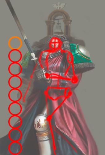
So lets look at some specifics at chapter master Haroth, the guy you can see a beginning concept for in the previous entry:
Haroth is old. Not by means of Space Marine Commanders really, but he is still some 300 years old.
Normally, an Astartes would look to be in his thirties, or maybe forties at 300 years, but Haroth has heavier weights on his shoulders then most Astartes, and they show in his features.
He has long, black, hair that is turning Grey. He has wrinkles and tired eyes, as well as age-spots that begin to appear. This is partly due to the fact that the Chapter he is master of, the Angels Cruentis, almost exclusively operates within the warp.
They excel at attacks on Demonworlds, boarding vessels within the empyrean and fighting on worlds close to warprifts, such as Cadia or similar worlds that arent IN the warp per se, but close enough to have extraoirdinairy amounts of interference with the warp due to its proximity.
This closeness to the warp and the sheer amount of stress it causes the body of a being from realspace, has caused Haroth's look of age.
Many brothers loose their life in the warp (a surprisingly low amount due to attacks of empyrean beasts on the minds of crew-vessels though) and the constant onslaught on the mind from the warp itself means that the body is showing the stress in form of ageing.
It takes a grave toll to see warp-things almost on a daily basis for some 300 years.
Haroth is also a twin, much like many of the Astartes in the Angels Cruentis, a strange jinx from the last recruitmentplanet the chapter has used, whereupon single children are rare, and tins, triplets and quadruplets are the norm.
Unlike most of the Angels Cruentis, though, Haroths brother is no oirdinairy Astartes. He has let his body and mind be taken into an entity called the Metatron.
An ancient machine from before the unificationwars, the Metatron has been refitted to take the mind and body of three beings, a Psycher, an Astropath and a Navigator, into itself and forming a mix between machine and living thing. The Metatron has some traits of all three persons that is fused ith it, but is an entirerly different being still. It is used to increase the safety of travelling through the warp, effectively being a Lifebuoy, a lighthouse and a map at the same time, as well as enforcing the Gellerfields to make them somewhat stronger.
It is with the aid of the Metatron that the Angels Cruentis can use boardingtorpedoes and fighterplanes within the warp, as long as they do not venture outside the Metatrons event horizon of course.
The Metatron is stationed on the bridge of the Primarchs Wrath, the flagship of the Angels Cruentis, and Haroth sees his brother, Maruth, every day he is on the bridge.
This has also taken a toll with the Chaptermaster.
Like all Sars of the Chapter( remember? Sar = Prince ) Haroth has psychic abilities. HE is not as potent as a Librarian (though some of the Sars are Librariansà but he has enough power to have him wear a psychic hood, just like all Sars of the Chapter do. The do spend alot of time in close vincinity to demons and warp-energies.
Haroth is also a member of the Malakim, the elite "inner circle" if you will, of the Chapter. Every Sar, every Librarian and every chaplain of the chapter is a member of the Malakim. They are the part of the chapter that have access to tactical dreadnought armour (terminator armour) as well as some of the finest weapons and gear the chapter has access to. Their like a first company of any other chapter, or like the Deathwing of the Dark Angels.
Like all Sars, Haroth has a personal iconography that he wears on his right shoulderpad, as well as the less stylized icon of his own Host on the left shoulderpad.
Sar Haroths iconography is an emerald green pattern that emmanates from a lighter circle. Within the circle a bell is fit. This bell is incorporated into the iconography of every chaptemaster of the Angels Cruentis and represents the fear the chaptermaster induces in the enemies of the chapter.
Haroth is also lefthanded. Like most Astartes, Haroth can use any weapon in any hand, though he perfers to use his left hand as his main hand. As such, Haroth will weild a close combat weapon in his left hand, and a firearm in his right hand, since the Angels Cruentis mostly fight in close quarters, the melee weapon becomes more important and thus ending up in his favoured hand.
As a chaptermaster, Haroth has access to the best the armoury of the chapter can offer. Haroth prefers to wear an artificers suit of armour, one of the few in the chapter that is rigourusly mended to look as if new (where many of the rest of suits of armour in the chapter has patched-on sollutions and extra plating, in wait of the next time the chapter goes to recruit, and subsequently, resupply).
He wears a crimson robe, almost always, even in battle, and his backpack sports a bell that holds a refractor shield.
So what does these things mean from a visual point of view?
1) Haroth looks old. He looks to be in his late 50's, atleast. Probably even his early 60's.
2) He has two servicestuds on his forehead, representing two centuries of active service (almost three though, and at that point a thir stud will be added)
3) He wears armour that is white (member of the Malakim) appart from the shoulderpads, which have emerald green on them.
4) his armour is artificies armour, meaning that it looks like standard Astartes Powerarmour, but with some alterations, mainly of decorational merit
5) His backpack has a bell attached on the top.
6)If he carries any weaponry, he carries a melee-weapon in his left hand and any guns in his right hand, unless only armed ith one weapon, upon which it is in his left hand
7)He wears a robe. A red one, over his suit of armour
And a couple of other things....
This wouldnt be a proper update without something to look at, now would it???
Here's something to gander at...

Till next time
David Sondered
How to design a new chapter, graphically pt314 july 2011
Time flies.
I have had some hectic months with deadlines et all interveining with the blogging.
Anyways, back to designing a chapter.
A surprisingly high amount of Astartes of the Angels Cruentis have, at the very least, latent psychic abilities. Whether this comes from the world they have recruited from the past centuries or some gene in the chapter itself is unknown, but considering the fact that psychic mutation being high amongst certain populations on certain worlds, plus the fact that an abnormality already exist on the Planet of Tham III.
(The Angels Cruentis do not have a homeworld per se but instead have a fleet that serves as their homebase. This fleet conscist of three larger battlebarges; of which the flagship "the Blooded Wing" is one, ten smaller battlebarges and two ships that contain supplies and trainingfacilities.
Beeing a fleetbased chapter, they still maintain a handful of systems they frequent for recruitment purposes. The most recent, and stable, of them being the Tham system in Segmentum Pacificus. Worth mentioning is that the Angels Cruentis have a few systems they recruit from, but those systems seem to more or less have been chosen by chance.
In their last two campaign to recruit, the Chapter picked up about 250 new recruits per campaign, out of these, about 75% (108) survived to become full Marines. Out of these 108, a third where twins. In both instances, the Chapter recruited from the planet Tham III in the Tham system in Segmentum Pacificus.
A freak twist of nature had made the planet Tham III a place where one in three births rendered twins or triplets amongst the feral population. As a resault, there is a large number of Angels Cruentis that are not just Battle Brothers, but actually twin brothers.
A notable example of this is the current Chaptermaster Haroth, and his twin brother Maruth. Haroth became the Sar(Captain) of his own Host after quite some time, whereas Maruth was very early concidered to be one of the strongest Librarians in the Chapter.)
As such, every single marine has a miniature gellerfield attached to them. Or rather, a METATRON-FOCUS_hood.
It's sort of a psychic hood, mixed with qualities of the Geller Field.
This hood can be seen in the WiP of Sar HAroth in my previous entry.
It looks like a shorter psychic hood, alternatively like a higher collar with some tech added to it.
With this high number of psychic abilities, latent or not, there is a high number of Librarians in the Chapter. So high, in fact, that almost all the individual Sar's are Psychers, and even two of the chaplains.
Rigid training, as well as the protective meassures provided by both the Metatron-focus-hoods and the Metatron entity (onboard the Blooded Wing) help the Chapter maintain a very low amount of breaches to their Geller-fields.
The training of new Librarians fall to the Librarus, and Master Librarian Sosol...

More next time....
David Sondered
How to design a new chapter, graphically pt423 july 2011
Anatomy
So here's a killer debate- what is good anatomy, and what does it have to do with Space Marines?
Whlst posting a few more updates on the image I'm doing to show off my Angels Cruentis, I have come under some flak.
Basically, the anatomy is concidered to be off, not at all consistent with "real" anatomy, or just not folloxing the "proper anatomy of Games Workshops marines".
Let me start by saying a few things on anatomy in illustrations, then move on to Games Workshop and finally show some examples of why I have chosen to do what I do.
Human anatomy is quite easy to grasp:
You look at a human being and you note where things sit, then look at your next human being and note that things sit roughly in the same spot.
That doesnt mean that anatomy is easy to implement when painting.
Alot of artists have difficulties with anatomy, especially in the beginning of their careers.
I have worked with these things for well over ten years now, and the last four years on a fulltime level.
I have still some difficulties to get it right some times.
What this gives is that I have to repaint things. Usually a painstaking ordeal that make things take alot longer. But, and this is the crunch-point, the anatomy is easy to grasp, its easy to see when it isnt correct.
Now the flak I got was in regards to Spacemarines in particular, which makes things a little more confusing, and I believe that alot of people are looking at it without taking in all the facts.
Fact number one-
Anatomy is very easy to grasp, with a naked or lightly clothed person. A space Marine is neither when in his armour.
A naked or lightly clothed person is actually quite close to a knight in armour- a Space Marine is not.
The armour of a Space Marine is, logically, several inches thick. The armour of a knight is not even a single inch thick, hardly even a third of an inch.
I'll explain why the armour of a Space Marine is several inches thick.
Everyone who has read up on the Space Marines know that they are about 7.6 feet (2 meters 30 cm) tall. This more exact figure comes from Jes Goodwin really ( http://podcast.games-workshop.com/mp3/DP4_JesGoodwin.mp3 ) and the designstudio of Games Workshop.
Jes also sais that the Spacemarines are very muscular (4 basketballplayers bolted together).
) and the designstudio of Games Workshop.
Jes also sais that the Spacemarines are very muscular (4 basketballplayers bolted together).
Now, take a look at any generic marine figure, or an illustration from a codex, and you will see that the thickness of the collar around the neck and the thickness of the vambrace is thick, very thick.
( e.g. http://www.games-workshop.com/gws/catalog/productDetail.jsp?catId=cat440193a&prodId=prod1060074 )
From where I am looking it looks like the thickness of the armour is somewhere between 2x the width of the nose and the distance between the pupils of a Space Marine.
Now take your pick and meassure that distance on yourself. Thats between one and two inches depending on what you pick.
But it doesnt end there, Spacemarines are bigger then normal humans, and actually, by looking at figurines and artwork from GW, they are _somewhat_ proportional (the figurines have them with oversized heads actually, or undersized armour, more likely, but thats for later in this article).
So that puts us at the fact that Space Marine armour actually is more like somewhere between 2 and 3 inches thick.
Of course, some might say, this is around the neck and the wrists, but think about that logically- where does armour need to be the thickest? Not around neck and wrists, that is actually the spot where the armour (for flexibility of joints' sake) need to be thinnest.
So lets, for the sake of argument, assume that the armour is 2-3 inches thick all over, except at the joints, where it is slightly thinner.
And at this point you will have a bulky figure that actually doesnt really look that anatomically correct at all. It will look squashed and chuncked together. The only real way to get the figure to look as what it is; a huge demi-god of war, is to put it next to some normal humans.
Now this is an image I found on the net where someone made their own suggestions on size, but ignore the largest of the marine figures and just look at the two other. Thats the difference between the 5.7 human and the 7.6 marine... in armour. That just doesnt seem right in my opinion, concidering the Marine is atleast a good head taller.
http://www.thepaintingshopworld.com/wp-content/uploads/2010/07/spacemarineheight.jpg
So how did Games Workshop
solve this in their artwork?
They didnt, really. I have very rarely seen any illustration with a spacemarine next to a normal human. It just doesnt happend that often. However, the size has to come through anyways.
This is where something called "heroic anatomy" comes into play.
Heroic anatomy is based upon something called the 8-head anatomy.
The 8-headed figure is an anatomical figure that sometimes is referred to as the heroic figure. It exist in illustration and he purpose of it is to show a powerful figure, strong and sometimes slower then other figures.
When GW first wanted to display the space Marines, they wanted it to show that these guys where the business. They where stronger, taller, bigger, faster and everything else that means "the biz" in comparison to "mere" humans.
Thus the lionpart of the marines drawn/painted in the first editions of 40k where 8-headed marines.
The normal anatomy of a human is generally 7 heads tall (that is, you can fit 7x the head of the figure from to to bottom of the figure itself in a straight-standing pose).
The problem that the GW team faced when illustrating then, was that the armour just didnt look right, the Marines looked like their armour was paperthin, which just couldnt be (that is set for another race, the eldar, which have very thin armour because of their technological advancement). So to sort this, the GW studio tossed that out and invented the 10-head-armoured anatomy.
In this form of anatomy, the marine is 10 heads tall, in his armour.
That is, if the marine is helmetless, but still in armour, the head will fit ten times from head to floor of the entire figure. In armour.
This change in anatomy happened just when GW was going to release the latest edition of Codex Dark Angels. I have been searching for it, but I cannot find the article it was in, I remember reading about it in a WD around the time, but alas when I moved country I only saved the images from the 200+ WD I had laying around. I have made refferences to it in topics I wrote at the time online though, and I have it clear in mind. I believe the person who used the expression 10-head-armoured anatomy, was Dave Ghallagher, but I could be wrong.
 In this image I show how I implement the same anatomy.
The image is cropped before the floor, but you can see how nine heads fit until the image is cropped.
In this image I show how I implement the same anatomy.
The image is cropped before the floor, but you can see how nine heads fit until the image is cropped.
Terminator Armour
Now I got even more flak for the way Im painting my Master Librarian, Sosol.
Basically, I've been told that I have no sense of anatomy-knowledge, and that I should practice more.
Always nice to get told that by people who don't even grasp anatomy in the first place, but I guess everyone is entitled to an opinion.
 So the only thing that just doesnt work out is two things:
&° The legs will stop way to high inside the armour, and the arms seem to be slightly too close to the body to fit within the arms of the armour.
Looking at the Terminator Armour of GW, this is actually more anatomically correct when it comes to the arms then those of GW.
The legs, well, I am a firm believer in plausability.
It needs to be possible and plausible. Hence I always thought of terminator armour as the way the armour of the marines in Starcraft works- the furthest out bits are mechanical.
So the only thing that just doesnt work out is two things:
&° The legs will stop way to high inside the armour, and the arms seem to be slightly too close to the body to fit within the arms of the armour.
Looking at the Terminator Armour of GW, this is actually more anatomically correct when it comes to the arms then those of GW.
The legs, well, I am a firm believer in plausability.
It needs to be possible and plausible. Hence I always thought of terminator armour as the way the armour of the marines in Starcraft works- the furthest out bits are mechanical.
Now this isnt all of the story of course. My terminator armour is way taller and also a bit broader then the terminator armour as shown in codexes and in figurines.
This comes from the fact that the terminator armour from before the heresy and during the heresy was alot larger then the "current" Terminator armour.
(this bit of fact comes from Black Library sources).
Looking at images from "The Horus Heresy 1-4", the Terminator armour of the different legions varies in size, but amongst the smallest is that of the Thousand Sons... an example of their armour is here:
http://wh40k.lexicanum.com/mediawiki/images/7/75/UthizzarandCult.jpg
Reading the books from the Heresy-series, the size that is given gives the indication to be about as tall as a "current" Dreadnought (the Heresy Dreadnoughts where substantially taller, as shown in the latest Forge World release of a Heresy-era Dreadnought:
http://www.forgeworld.co.uk/Images/Product/AlternativeFW/xlarge/contemptor16.jpg
The Angels Cruentis have a very old Armour Park, their armour not being more modern then Heresy-mark armour.
So it would make sense that the terminator armour would be bigger then the regular SM terminator armour of the 41st millenium. At the same time, it would also make sense that their armour would be more worn, starting to get pieces lacking amongst some of the chapter and having been exchanged for less good armour pieces made on site by the chapters personal armoury, rather then the forgeworlds used by regular Chapters.
The exception, of course, would be the higher officers of the chapter, such as the Sar's and the Masters of Librarium etc.
I hope that this little edition explain some things in regards to size and anatomy.
In the end, it will always be my own vision on Space Marines, an so if you dont like, that is a shame. I hope you will read the final novell anyway.
Until next time,
David Sondered
How to design a new chapter, graphically pt5.9 Jan 2012
Hello again,
Time for an update of this blog.
Alot has happened since I last wrote here. mongst other things the company webpage has come up:
www.studiocolrouphobia.net
Where a lot of things has been posted since the first day.
This does, however, not mean that the workings on the Angel Cruentis has been postponed. Far from it.
Today I'd like to talk about armour, the refitting and patching up of armour when far away from resuplies, as well as modifying armour to suit the current situation you fight in.
To do this, I will have to give away a little bit of info on the Angels Cruentis.
Like you'd mind!
The Angels Cruentis are a fleet-based Chapter.
I can hear the groans all the way here. But it does not stop at this, they spend almost ALL their time within the warp. These things you already know if you have read the previous parts of this blog.
Without going into specifics, the Angels Cruentis has a device that help them maintain an almost perfect view of the astronomican at all times; the Metatron Device, an ancient device from before the unificationwars that was rebuilt during the great crusade and has successively been refitted by the Angels Cruentis to work on the power of three individuals, a Librarian, an Astropath and a Navigator.
This was never intended with the Metatron device and the alteration has had a spectacular side-effect:
Although the three sacrificed individuals will never survive this ordeal, their beings are used by the device to see the Astronomican, to give it a, albeit cryptic, prophetic ability and boosting the Gellerfields, making it possible to create free floating "pockets" of Gellerfields between two vessels of the Angels Cruentis.
Essentially: If the Angels Cruentis have one ship on each side of an enemy ship (obviously with a certain proximity to one another) they can board the ships using jumpacks rather then traditional boarding tubes.
The danger, when boarding an enemy ship in the warp, lie mostly in the fact that the enemy ship usually do not have any Gellerfields to protect its inhabitants from the warp, but the solid parts of the ship is usually enough to stall anything bad from happening for a while. The usage of torpedoes to open breaches, and then jumpacks to get in, greatly increase the time the ACs has to board and carry out a mission.
To further increase their chances, the AC also have done quite some modifications to their armour. One such thing is the psychic collar which is fitted on each suit. Essentially "half" a psychich hood it keeps the marines from going insane and at the same time amplifies the Psychic abilities of a present Librarian to make life easier on them all.
So what other modifications could we expect?
Well, here are some helmet varients.
Please noote the older type of helmets as the AngelsCruentis do not have more modern equipment.
Also note the alternate mouthpieces that do not exist elsewhere. These represent either rtificers armour varients or altertions to either patch up abroken helmet or to further the capability of the helmet, whether physically or psychically.

Until next time!